UI for Contract Exploration Tool
DATE | Aug. 2018
TOOL | Adobe Experience Design
Contract Linking is a project that develops a contract exploration tool for legal companies. Legal people could search for certain keywords in the application, and review details of contracts from the search results. I was responsible for identifying the user flow and creating user interface mock-up for future implementation. I was based in Thomson Reuters Labs in Boston, this project was a collaboration with the data scientist team from the Lab in Waterloo, Canada. Corey Ouellette, the Data Experience Developer also based in Waterloo was my primary advisor for this project.
From Data Visualization to User Interface
The data science work for this project is extracting data from PDF files and identifying the entities, and the users would use this tool to explore the contracts. The data scientist team needed a visual technique to show the results. “Data visualization” was the first visual technique that we targeted, and the original goal was to show the relationship between entities, clauses and contracts. The results could be displayed as a network chart, a data table or a sunburst diagram. However, the purpose is for legal people to explore and review the contracts, these visualizations seem taking too much space on the screen. Moreover, users could spend more time than expected on interacting with visualizations instead of contracts themselves. Therefore, I decided to think about “how would user use this tool” first, and see if data visualization could help during the process.
↓
Exploring possible formats for visualization.

User Flow
Although I am not a legal person, nor do I understand legal terms, there is a general process when users use a web application to explore through a bunch of documents. First, users would type in “keywords” for search. The application filters out the results based on the keywords. Later on users can view documents from the search results.
↓
User flow for first version of prototype

How to Display “Search Results”
How to display search results is the major challenge of this project. The search results are the contracts that include keywords. The results will also serve as “menu”, helping users navigate to a section, a clause or a sentence in a contract they need. Therefore, we need a visual message to tell users “Hey, this contract/section has the keywords you just search!”, and use frequency or other measurements to show how relevant that this contract or this section is to the keywords. To achieve the goal, I have tried some ideas.
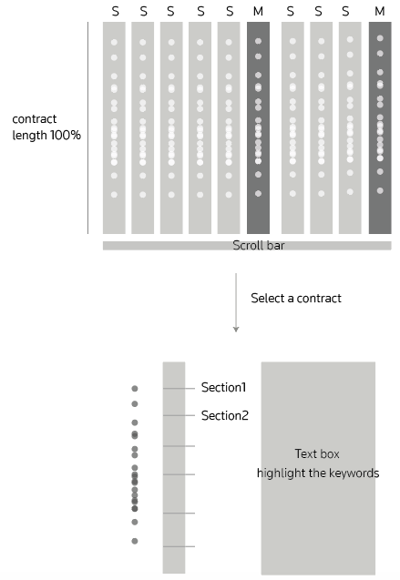
This approach uses circles to locate where keywords are in contracts, one circle is one time the keywords show up. This approach could help users get a sense of how the keywords distribute across multiple contracts. After they see the results with multiple contracts, users could select one and go into next page for a single contract. However, if users are in the single-contract view, and they would like to see other contracts, they would have to go to last page and select another. It would be better to prevent this back and forth process.
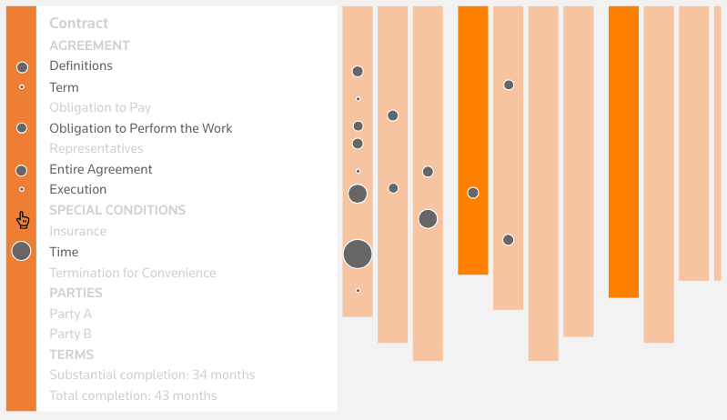
This approach shows the relationship between keywords and sections in contracts directly. The scale of circles indicates how relevant the sections are to the searched keywords; the bigger the circle, higher the relevance. When mouse over an orange bar, the box with contract sections will be opened. If a section has no keywords mentioned, then that section will be in lighter color so that users would only focus on related sections. However, the first problem with this approach is “the scale of circles”. Since the space of showing the relevance circles is limited. Within a narrow space, the difference between circles would be invisible. Moreover, if we try to make the difference more apparent, circles that represent “only a little bit relevance” could be really small, which is not helpful. Another problem with this idea is also the redundant interaction. Similar to the last idea, users would need to go back and forth between contract menu page and contract content page.
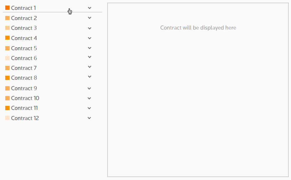
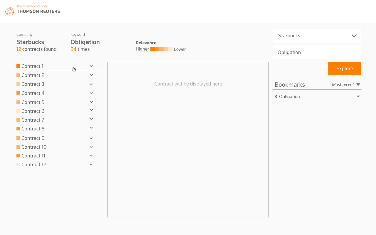
In order to solve the problem about “scaling” and “redundant interaction.” I decided to 1) standardize the size of the symbol of relevance, using color to indicate different level of relevance like a heat map. 2) display the contract menu and contract content side by side, instead of having them in different pages. With this approach, users could get a overall sense of how relevant the contracts are to the keywords they search; the darker the orange, the higher the relevance. If they are interested in a contract, they could click and open the contract tab, go into a section, and the content will be displayed on the right.
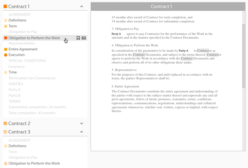
The search results are not only a list of related contracts, they are also act like menu to help users navigate across contracts and within a contract. The menu is expandable, users could open contracts drop-down menu and see the detail of relevance by section. Once they click on a section, the section’s content will show up on the right. User will always see menu and contract content together, and go to other contracts/sections without switching to other pages. This "side by side” design was actually highly valued in the user interview, because it’s intuitive to explore and view the contracts from users’ opinions.
Involve user Insights
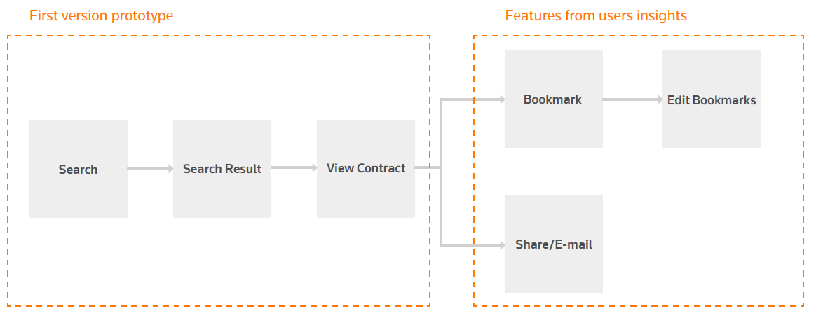
After we had the mock-up from “search,” “search results” to “view contract,” the next step is to get user’s insights. How would they apply this tool to their daily work flow? What would they want to do with the contract they found? During the interview and testing, we had a clear direction on what features we should keep, what to eliminate and what we should add. “Bookmark” and “share/email” are two features that the users would like to have.
↓
Revised user flow involving user insights
↓
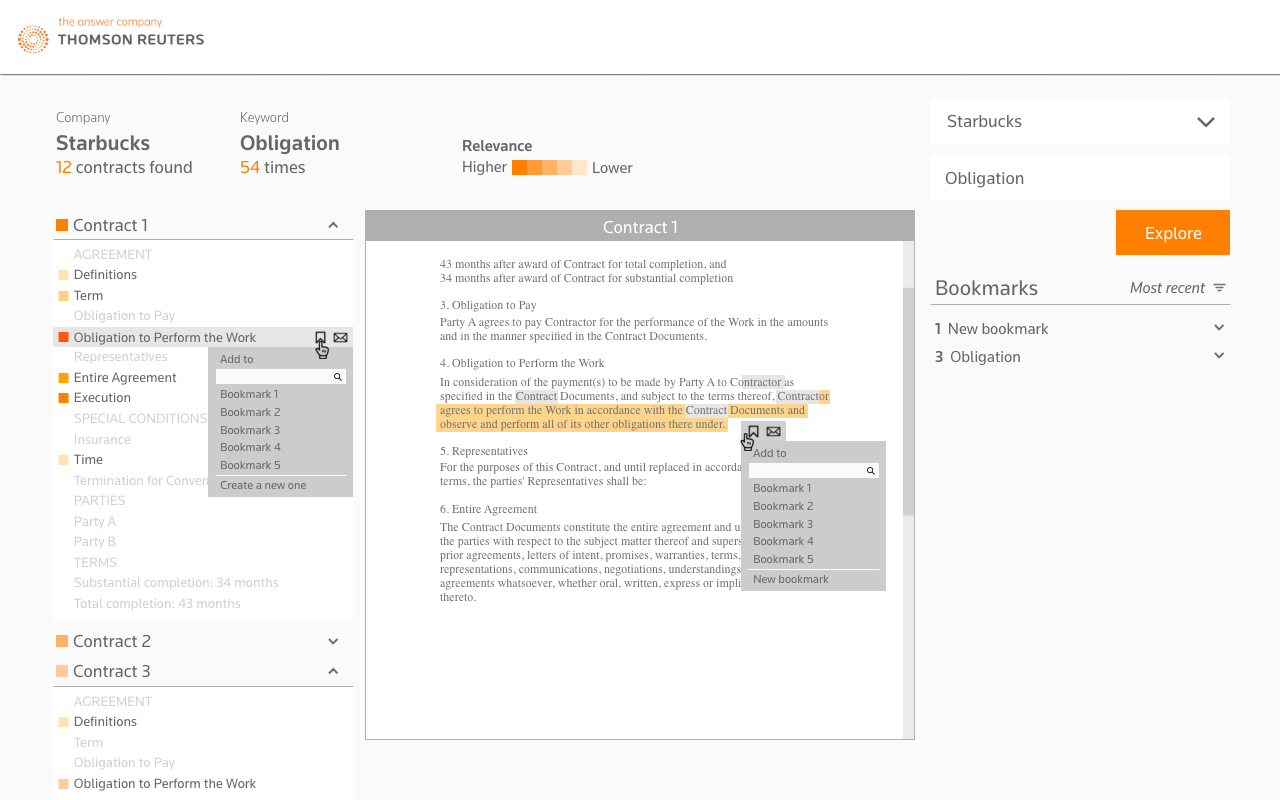
Users could bookmark a section from menu, or bookmark a highlighted content from contract.
↓
Users could share/email a section from menu, share/email a highlighted content from contract or share/email a collection from Bookmarks panel.
Get All Interactions in One Page
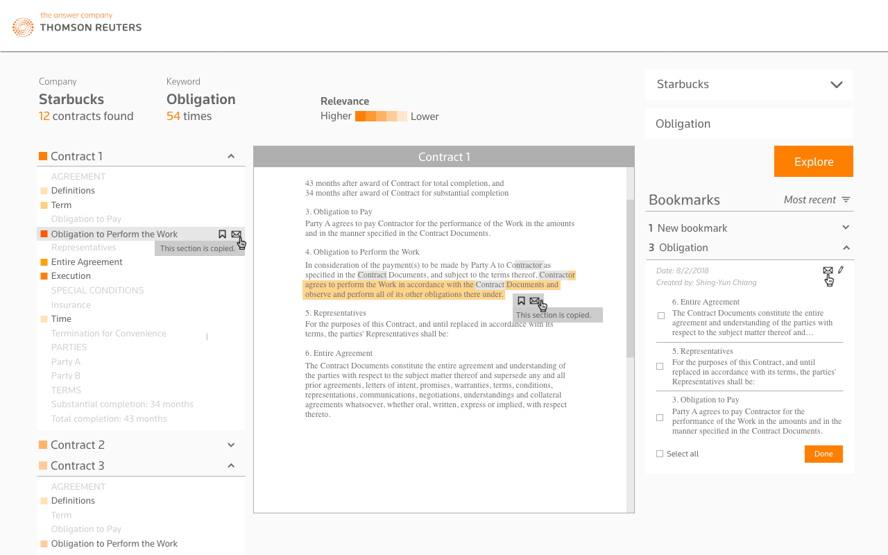
In oder to make the exploration easier, I designed a single page interface. Only the start point of search has its own page. After users start searching, all works including “navigation”, ”viewing contract”, “bookmark”, “share/email” and “do a new search” could be done in one page.
↓
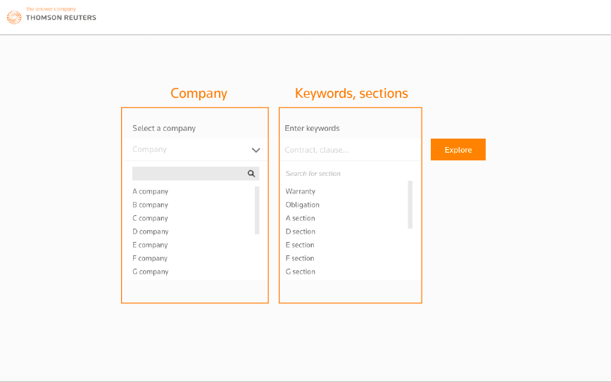
The starting point of search has two search bar. From the interview/testing, we found that the targeting users are clear about what kind of contracts with which companies they would like to investigate. Therefore, I use one search bar for a company, another search bar for contract content.
↓
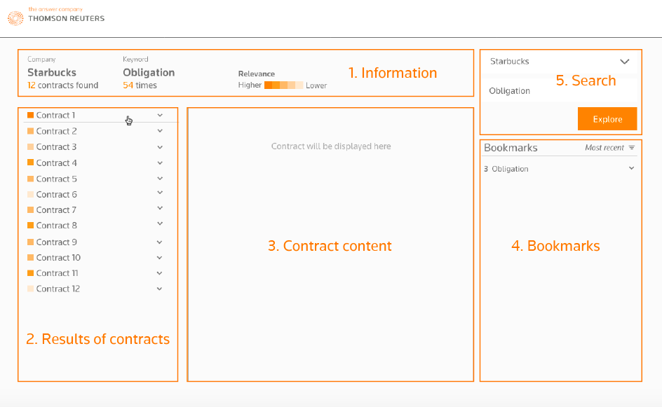
The single page design enable users do most of the works in one place. Panel 1 is the information panel; panel 2 is the results of contracts and also the menu; panel 3 in the middle for showing contract; panel 4 for managing bookmarks; panel 5 for starting a new search.
