Income Disparity in The States
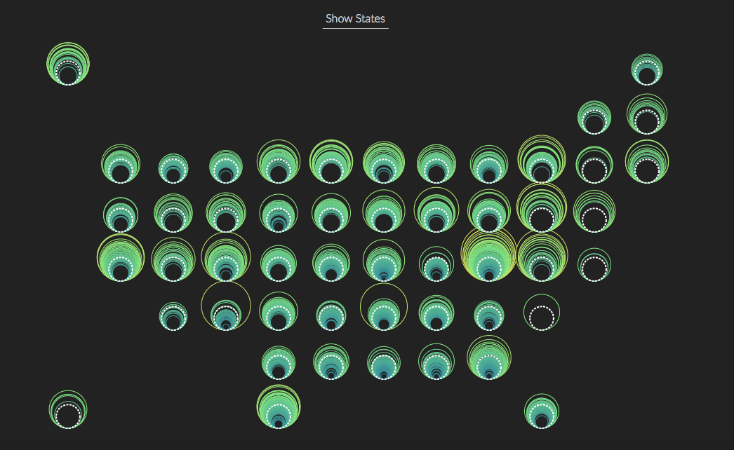
This visualization displayed how the wealth distributes in the United States. I used the median household income data from 2012-2016 American Community Survey 5-Year Estimates. One circle is one county, the scale of circle and color indicated the amount of median household income. From this visualization, readers are able to compare the income level across states and within a state. Some states have many counties in yellow, meaning that more counties in these states are relatively wealthy. If the state has most of the counties in blue, then this state is a relatively poor state. By changing the views, readers can arrange states by geographical position as well as in the order of a state's income gap (from the lowest-income county to the highest-income county).
