Journalist Deaths
This project visualized each journalist death through years, countries they were killed and causes, with the connection to historical events. The data set is from Committee to Protect Journalists(CPJ). There were more than 1700 journalists and media workers killed over the world from 1992 to April 2017 (when I downloaded the data set), this project analyzed 1232 deaths which are motive confirmed.
Design Decisions
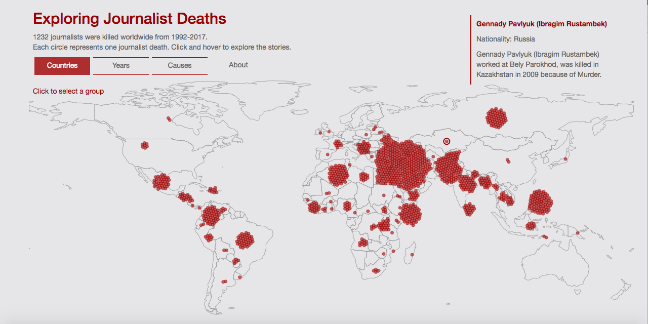
This data set caught my attention because I am also a journalist. I am interested in where and when the journalists were killed as well as what caused their deaths. The stories behind this are also important and will make this visualization more meaningful. Therefore, I decided to make every journalist as an entity, represented by a circle. I hope readers would view a data point as a person, instead of merely number. When hover over a circle, there will be a short description about the journalist in order to bond the readers and data.
↓
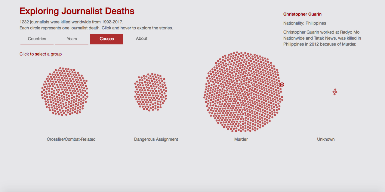
The reason why the journalists were killed. This visualization also shows the background information of journalists when users hover over a circle.
Data Insights
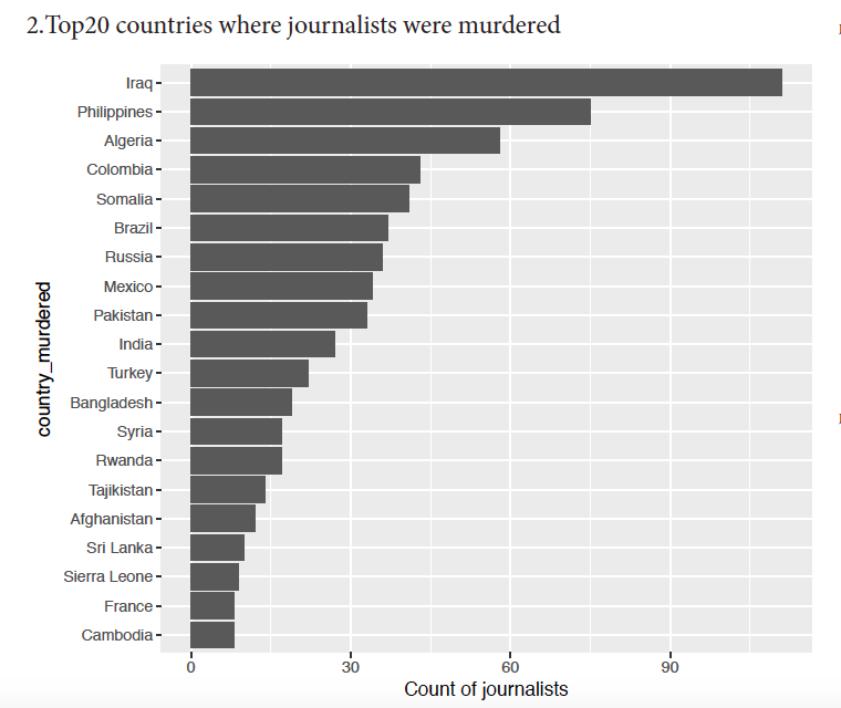
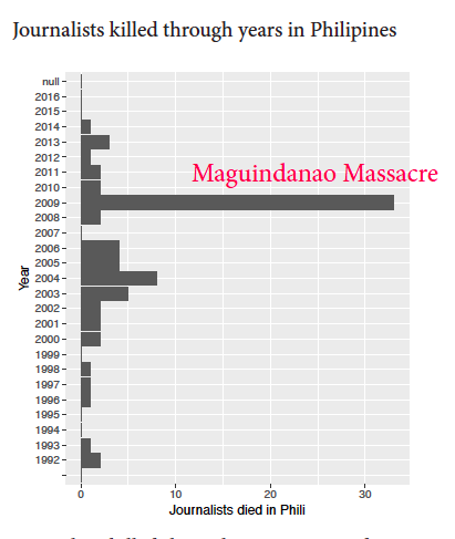
I explored the data with R and made some simple bar charts to get a sense of how this data looks like. Firstly I took a look at the top 20 countries where the journalists were murdered. It is not surprised that the top 1 country was Iraq, but the second country was the Philippines. As I know, the Philippines does not have war frequently, why it ranked 2? Then I focused on the deaths within the Philippines and looked at the data by year. I found that there was a huge amount of deaths in 2009, it’s when the Maguindanao Massacre happened. 30 journalists died during the tragedy. Therefore I came up with an idea to show the connection between journalist deaths and historical events that occurred in the top 20 countries.
↓
The top 20 countries where journalists were killed.
↓
There was an unusual number of deaths in 2009 in Philippines.
↓
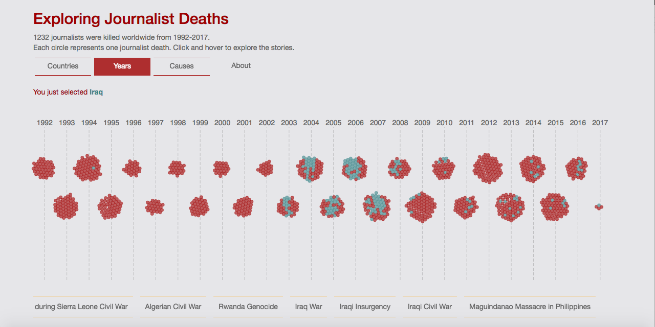
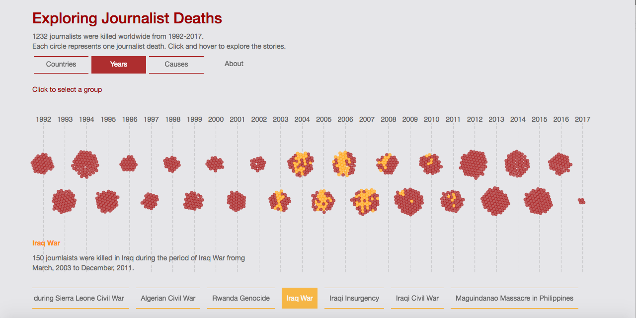
There is an event bar at the bottom, when hover over an event to show the connection to the deaths.
Interactions
This visualization has three views: Countries, Years, and Causes. It would be nice if it could have connection between views. Therefore, I made a feature to enable the connection. When readers click on a circle, it will select a group of circles of a country, year or cause depends on which view the readers are at. For example, if a reader clicks on a circle in Iraq under Countries view, a group of circles in Iraq will be highlighted. Then the reader switch to Years view, the selection is still active, and readers could know the journalists were killed in Iraq from a historical perspective.
↓
This view shows the distribution of journalist deaths in Iraq on a timeline.
