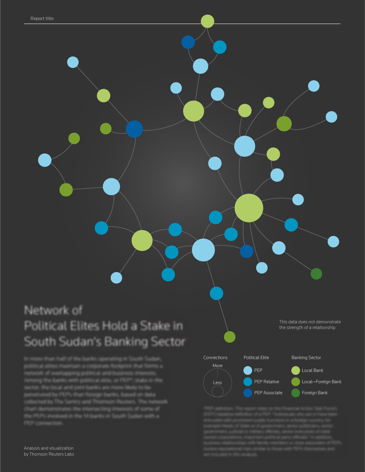
Network of Politicians and Banks
DATE | Summer 2018
TOOL | Python, R, D3, Gephi, Adobe Illustrator, Pencil
This project was to show the network of politicians and banks in South Sudan. I was working with internal analysis team and an external data analyst under Brian Romer’s supervision at Thomson Reuters Labs. For me, it was a journey of balancing opposites perspectives. Analysts acted as audience for my visualization in this project. We integrated opinions from analysts and designers, and reach a consensus on the final visual solution.
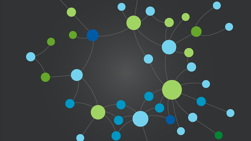
What Data Look Likes?
The data structure in spreadsheets from analysis team looks quit different from the structure ready for a network chart. Some work was needed to transform raw data into the workable format. Luckily I got some Python experts around, it is a nice chance to learn Python from them and benefit my project. I used Python to transform data into the format I need, and moved on to several visual experiments.
Trail and Error
A static network chart showing the relationship between politicians and banks is the expected outcome of this project. When a network chart is not interactive, it means that every node and every connection should be clear since users are not able to pull a node around or apply filters. A good news was that it is not a big dataset, therefore static format should not be a problem.
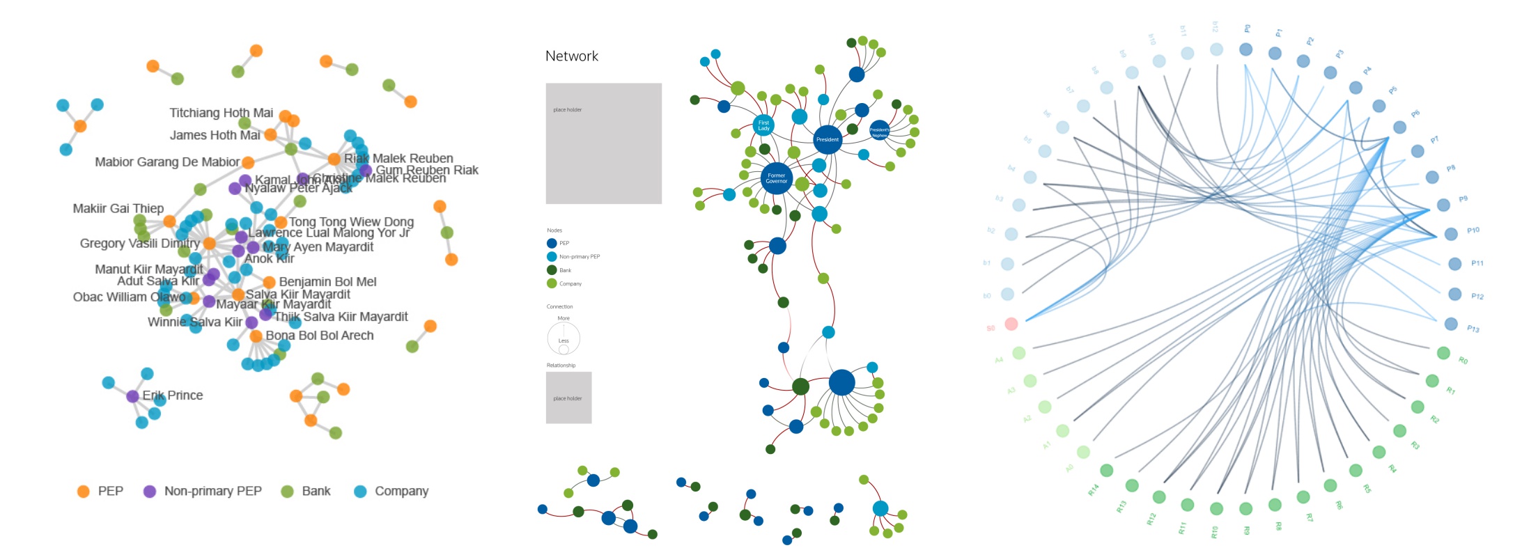
There are several ways to prototype a network chart. I have tried using D3.js, Gephi and R to make a few charts, but none of them formed a good shape. The chord chart from R was a potential solution aside from network chart, but this idea was rejected immediately from the analysis side. The existing and common (particularly for designers) solutions did not work out. I turned to the most fundamental approach — hand sketch.
Back To Simplicity
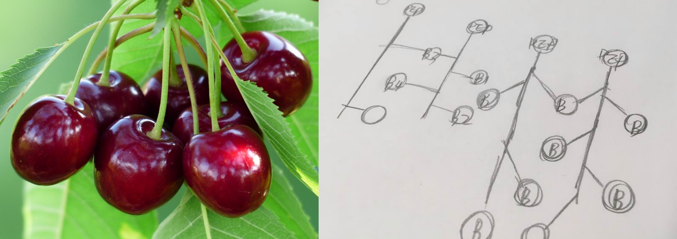
After trying several approaches that are common in visualization practice and finding nothing really works, I picked up a pencil and did some random sketches. In a discussion with Brian, he mentioned that we should be able to track every node, and some nodes might have potential relationship. For example, Bank A and Bank B both link directly to Politician C, this might imply that Bank A and Bank B have a connection potentially. Thinking further toward this direction, an image of “a string of cherries” came into my mind. Each cherry is separate but connected to the same point.
↓
A string of cherries (credit: Max Pixel) and hand sketch.
↓
The cherry-like network chart after styling
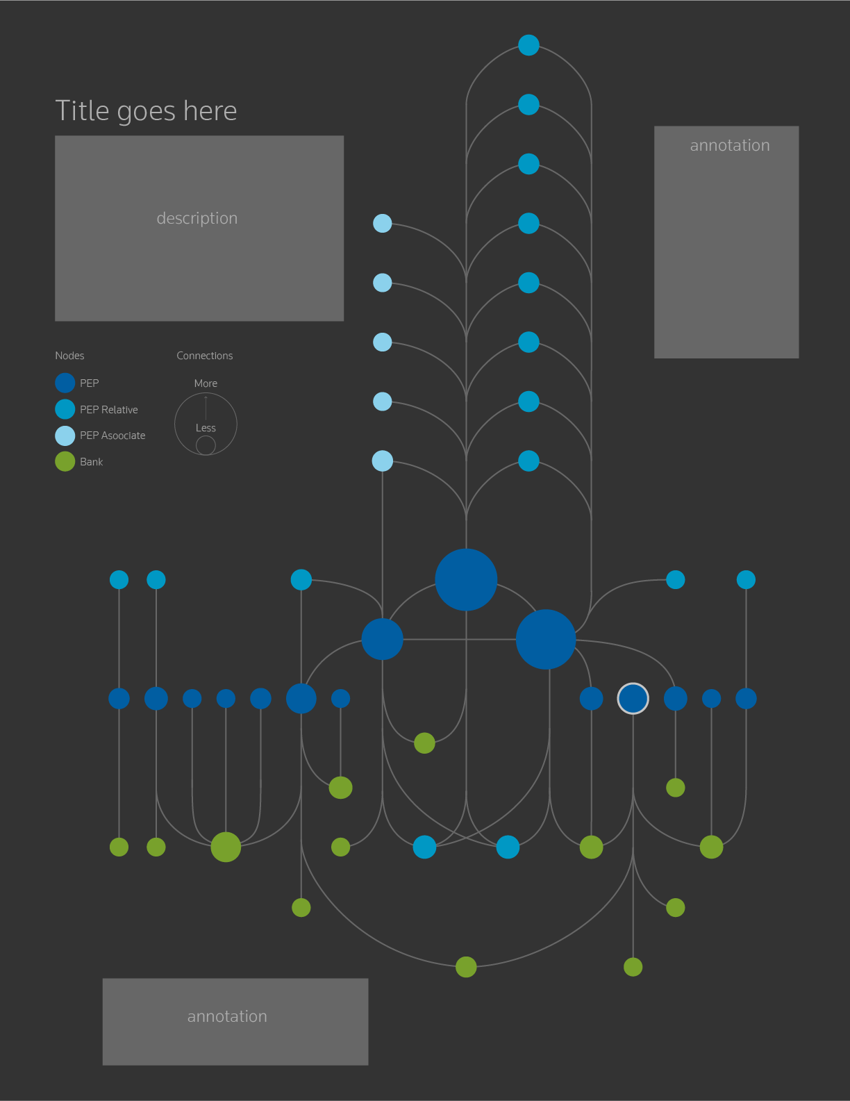
The outcome of the cherry idea worked really well, and this version reached the consensus from both design and analysis side. Circles in blue are politicians, those in green are banks. The size of a circle indicates the number of connections. The bigger, the more connections.
The Change of Data Structure
We were really happy with the cherry-like version, however, analysis team found some issues with data from the cherry-like network chart. They removed the data on connections that only between politicians and emphasized the relationship between politicians and banks. The data changed, the cherry version was no longer working. We then adopted the visual outcome from Gephi with updated data. Finally here the spider-web-like network chart is!
↓
The final delivery
