World Cup Watchers
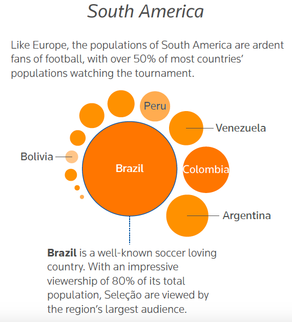
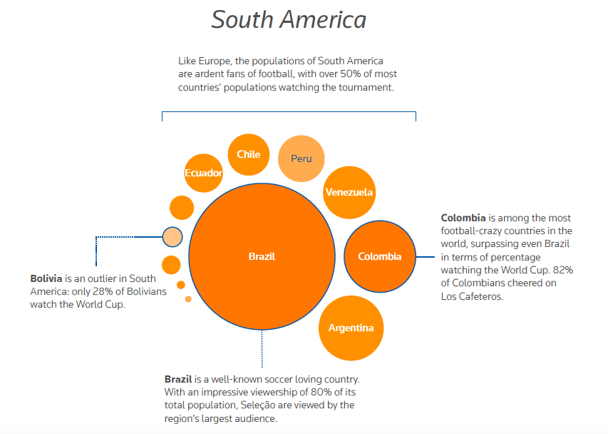
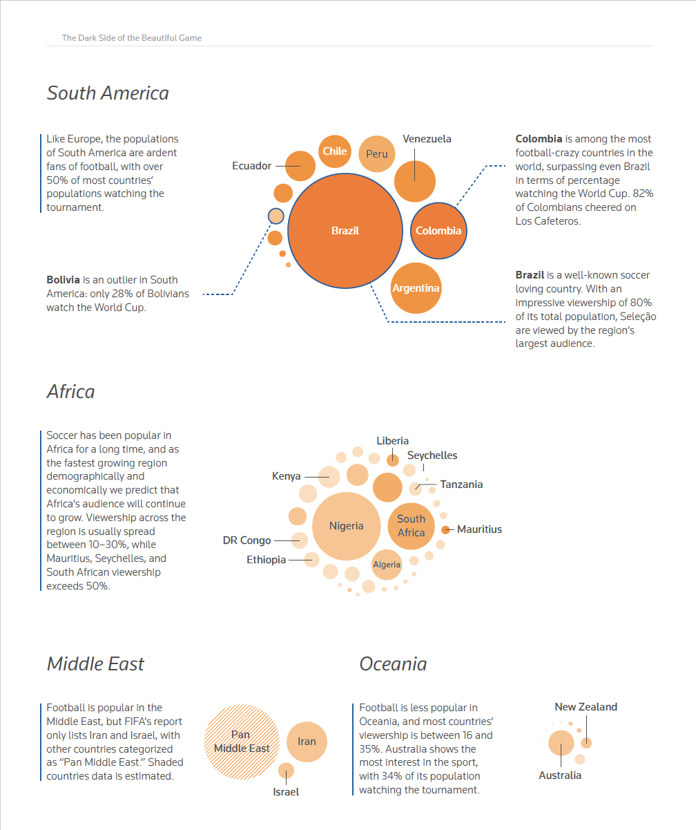
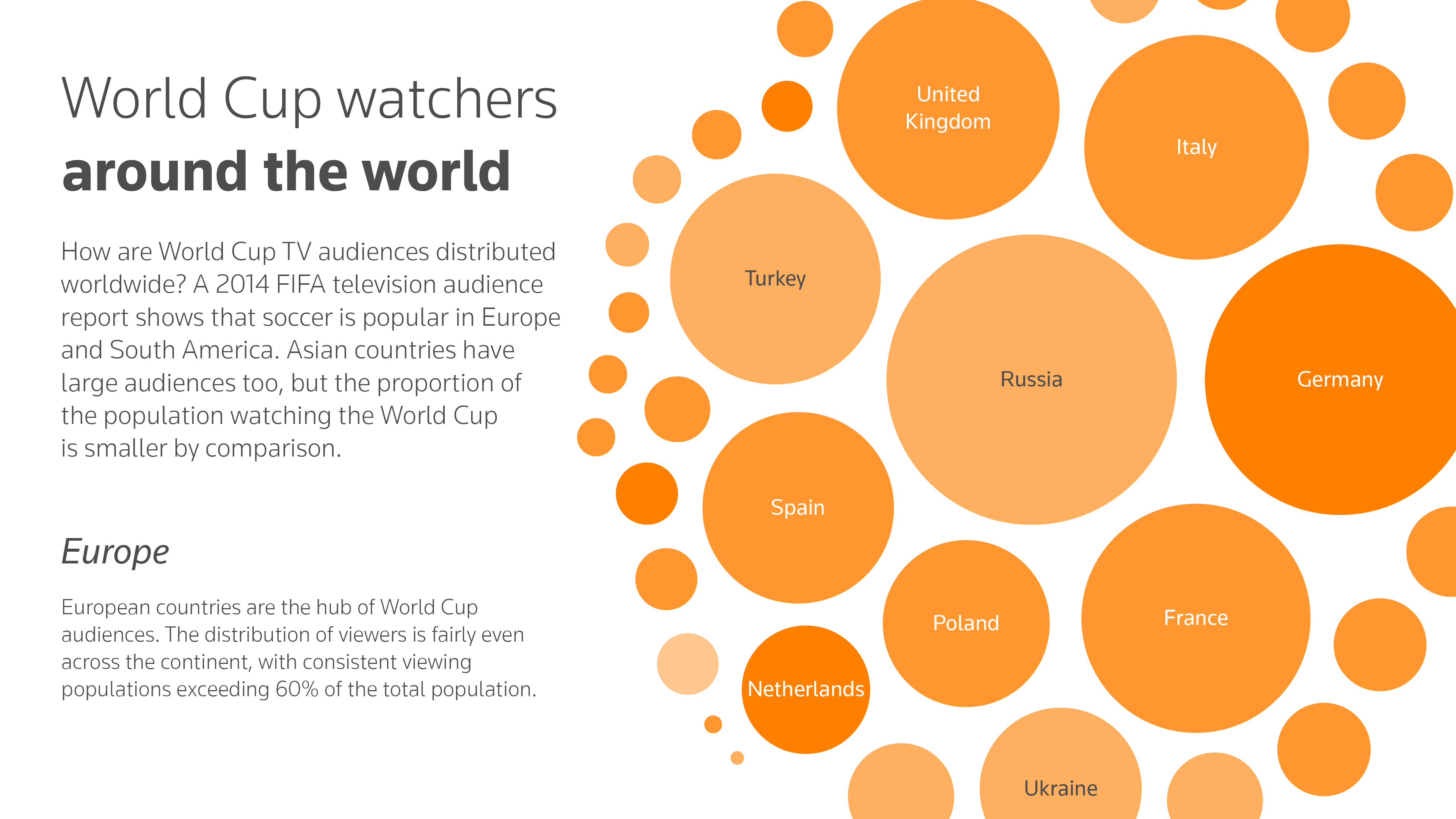
The “World Cup Watcher” visualized distribution of viewership of the World Cup in 2014. I used bubble chart to display the results. A circle is a country or a region. The scale of circles indicates the amount of audience. Color shade indicates percentage of audience within a country/region; the darker the color, the higher proportion of audience. It is interesting to see some countries (e.g. China) have a huge group of audience, but the audience is only 18% of its population. Most of the countries in Europe have higher percentage of viewership although they don’t have a large amount of audience.
Data Analysis
There are two kinds of datasets needed for this visualization: one is audience, the other is population. For the audience data, FIFA’s website has TV audience report for 2010 and 2014 World Cup. I obtained the population data from World Bank. After getting two datasets, I used R to combined them and identified missing data as well as inconsistent data. The last step was searching for Census report for countries that are missing from World Bank.
↓
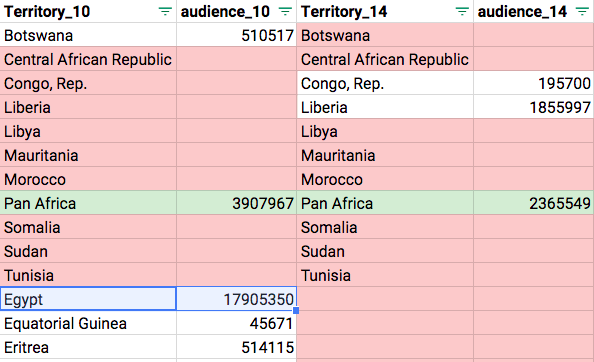
This data table shows that some of the countries were in 2010’s report but not in 2014’s, which caused the inconsistency of the data.
Design Decisions
Speaking about a visualization with global data, first idea came into my mind is choropleth. Choropleth is a nice format to show the distribution of a variable. However, FIFA’s report grouped some countries into a regional group (e.g. Pan Middle East) without listing out what countries are in the group. If we don’t know what countries are in that regional group, we couldn’t color them on the map. Moreover, choropleth is cable of showing one variable at a time, comparing the amount of audience and percentage seems not a good topic for choropleth.
Since FIFA provided two years of audience data, it could be possible to comparing two years’ data and see if there is any change between two games. However, the inconsistent data from FIFA was the major issue of this idea. For example, Egypt was in 2010 report but disappeared in 2014, it might be grouped into a regional group (e.g. Pan Africa). So that it was not possible to show the change between two years’ data for Egypt. Moreover, when speaking to where the big market of World Cup is, it would be better to visualize the audience by country/region first. “Change” is not primary.
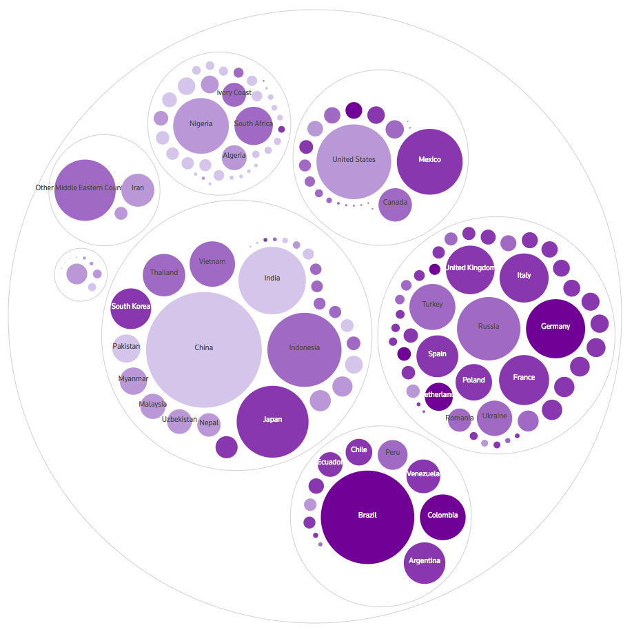
Due to the inconsistent data, we finally decided to focus on 2014’s audience data and used bubble chart as the visual approach. bubble chart has a unusual looking which could be eye-catching, and it has flexibility for visualization. For example, I could have a circle for “Russia", and another circle for regional group “Pan Middle East.” I used D3.js to plot the chart, exported it as a SVG file and edited the graphic in Adobe Illustrator.
Design for Different Platforms
The plan was to publish the static visualization for mobile, laptop and paper report. For mobile version, it would be less texts and less details, the paper version would be more texts and more details.
